作为Web开发人员,通常会从设计师那里拿到Sketch/XD/Figma设计稿。在设计稿中,对屏幕尺寸,字体,配色,布局,图片等等都进行了详细描述。有了这些信息后,首先需要在tailwind配置文件中定义这些基本样式,然后再使用这些样式分别实现不同的页面。
示例一:彻底覆盖tailwind默认样式
breakpoints
如果不使用Tailwind默认Breakpoints,则需要在tailwind.confg.js中进行定义。如果还要使用Tailwind中原来定义的breakpoints,则需要在extends下添加新屏幕尺寸,否则,可以彻底覆盖其screens的定义:
theme: {
  screens: {
    table: '960px',
    desktop: '1248px',
  },
这样后续就可以使用类似:
<h2 class="text-2xl table:text-4xl">定义配色
同样,这里覆盖默认Tailwind的配色:
theme: {
  screens: {
    table: '960px',
    desktop: '1248px',
  },
  colors: {
    white: '#FFFFFF',
    purple: '#3F3CBB',
    midnight: '#121063',
    metal: '#565684',
    'tahiti-blue': '#3AB7BF',
    'cool-white': '#ECEBFF',
    'bubble-gum': '#FF77E9',
    'coppper-rust': '#78DCCA',
  },
这样后续就可以使用类似:
<p class="text-purple">

<button class="border-purple">
<button class="border-metal/10">
boxShadows
同理,覆盖Tailwind中的默认设置:
boxShadow: {
  sm: '0px 2px 4px 0px rgba(11, 10, 55, 0.15)',
  lg: '0px 8px 20px 0px rgba(18, 16, 99, 0.06)',
},
Typography
字体大小
更改tailwind.config.js
fontSize: {
  xs: ['14px', {lineHeight: '24px', letterSpacing: '-0.03em'}],
  sm: ['16px', {lineHeight: '28px', letterSpacing: '-0.03em'}],
  lg: ['18px', {lineHeight: '28px', letterSpacing: '-0.03em'}],
  xl: ['24px', {lineHeight: '36px', letterSpacing: '-0.03em'}],
  '2xl': ['36px', {lineHeight: '48px', letterSpacing: '-0.032em'}],
  '3xl': ['48px', {lineHeight: '56px', letterSpacing: '-0.032em'}],
  '4xl': ['56px', {lineHeight: '64px', letterSpacing: '-0.032em'}],
  '5xl': ['80px', {lineHeight: '80px', letterSpacing: '-0.032em'}],
},
更新styles.css
如果使用Google字体的话:
@import url('https://fonts.googleapis.com/css2?family=Roboto:ital,wght@0,100;0,300;0,400;0,500;0,700;0,900;1,100;1,300;1,400;1,500;1,700;1,900&display=swap');

@tailwind base;
@tailwind components;
@tailwind utilities;
如果使用本地字体的话:
@tailwind base;
@tailwind components;
@tailwind utilities;

@layer base {
  @font-face {
    font-family: 'Satoshi',
    src: url('../fonts/Satoshi-Black.woff2') format('woff2'),
         url('../fonts/Satoshi-Black.woff') format('woff');
  }
  @font-face {
    font-family: 'Inter';
    font-style: normal;
    font-weight: 400;
    font-display: swap;
    src: url('../fonts/Inter-Regular.woff2?v=3.19') format('woff2'),
         url('../fonts/Inter-Regular.woff?v=3.19') format('woff');
  }
}
同时更新tailwind.config.css:
fontFamily: {
  satoshi: 'Satoshi, sans-serif',
  inter: 'Inter, sans-serif',
}
如果整个网站的默认字体都是inter的话,可以在body元素上声明:
<body class="font-inter">更改为Satoshi字体:
<p class="font-satoshi">示例二:扩展tailwind默认样式
在tailwind.config.css中增加额外样式
颜色
可以从Figma设计稿中获取各种颜色的定义。
theme: {
  extend: {
    colors: {
      'body': '#17171F',
      'nav': '#382452',
      'input': '#2A3B44',
      'input-border': '#666677',
      'selected-text': '#B2B3FF'
    }
  }
}
字体
fontFamily: {
  'poppins': ["'Poppins'", 'sans-serif']
}
然后去Google Fonts中选择对应的字体,比如poppins Regular 400 + Semibold 600 + bold 700。将对应的html代码复制到index.html:
<html>
  <head>
    <link rel="preconnect" href="https://fonts.googleapis.com">
    <link rel="preconnect" href="https://fonts.gstatic.com" crossorigin>
    <link href="https://fonts.googleapis.com/css2?family=Poppins:wght@400;600;700&display=swap" rel="stylesheet">
基本body样式
<body class="bg-body text-white font-poppins">其中的bg-body源自于自定义样式:
'body': '#17171F',而text-white源自于tailwind默认样式。
font-poppins源于自定义字体。
实现navbar
<header class="py-6">
  <div
    class="container flex justify-between items-center mx-auto px-8 md:px-14 lg:px-24 w-full"
  >
    <div class="text-lg font-bold">逻思编程</div>
    <div class="hidden md:flex space-x-12 items-center">
      <a href="#" class="text-selected-text">首页</a>
      <a href="#courses">课程</a>
      <a href="#tutorials">教程</a>
      <a href="#contact">
        <button class="px-6 py-2 bg-theme font-bold">联系我</button>
      </a>
    </div>
    <div class="md:hidden">
      <svg width="26" height="18" viewBox="0 0 26 18" fill="none" xmlns="http://www.w3.org/2000/svg"><path d="M13 17.5H0.25V14.6667H13V17.5ZM25.75 10.4167H0.25V7.58333H25.75V10.4167ZM25.75 3.33333H13V0.5H25.75V3.33333Z" fill="white"/></svg>
    </div>
  </div>
</header>
关于container对应的类:
- flex:布局方式
- justify-between:保证logo在左边,nav在右边
- items-center mx-auto:保证LOGO/NAV内容居中
- px-8 md:px-14 lg:px-24: 在不同尺寸屏幕提供不同的左边空白区
关于Navbar:
- hidden md:flex: 默认尺寸下,隐藏navbar,medium大小屏幕时,以flex方式显示
- space-x-12 items-center:设定子元素间距,居中
- 联系我按钮样式px-6 py-2 bg-theme font-bold rounded:设定x/y轴空白,背景色,字体,圆角等
- svg样式md:hidden: 默认情况下显示,但当屏幕尺寸大于medium时,隐藏
根据屏幕尺寸灵活的在横向/纵向布局
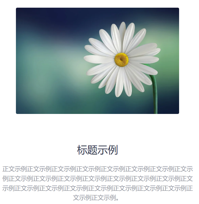
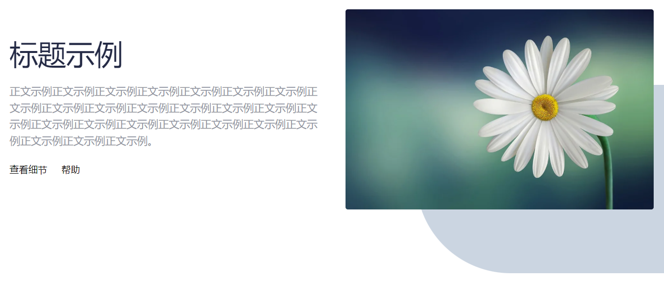
效果
手机屏幕下:
大屏幕下:
实现
首先需要做的就是对父容器的定义。
- 在默认情况下(小屏幕),使用flex布局且纵向布局。同时,在图文混排的时候,在小屏幕时先显示后面的图片子元素(flex-col-reverse)。
- 在大屏幕下,使用flex横向布局,这样子元素就会横向布局,同时先显示文字,再显示子元素。
<div class="container flex flex-col-reverse lg:flex-row items-center gap-12 mt-14 lg:mt-28">由于两个子元素均分屏幕空间,因此需要同时添加flex-1类。
如果要在大屏幕下的图片后面实现一个圆角阴影效果的话:
<div class="
    hidden
    md:block
    overflow-hidden
    bg-slate-300
    rounded-l-full
    absolute
    h-80
    w-2/4
    lg:-bottom-32
    lg:-right-40"
></div>
其中,
- hidden / md:block: 默认隐藏,md时为block
- overflow-hidden:重叠部分隐藏
- absolute: 使得图片脱离文档流,进而不受其他兄弟子元素的影响
- lg:-bottom-32 / lg:-right-40: 将图片向右下方偏移,呈现层次效果。